
SiView Redesign
Evaluating the UX of a Manufacturing Execution System used by over 100 semiconductor manufacturers around the world.
SiView is a Manufacturing Execution System (MES) that helps semiconductor manufacturers address their operational needs and challenges like:
Upgrading fabrication facilities and equipment to new technologies faster
Incorporating factory automation so as to be the best and fastest low-cost producers
Being flexible enough to accommodate increases in production volume, engineering changes, and increases in the use of automated equipment
Considering overall engineering and manufacturing efficiencies in multiple semiconductor manufacturers in order to ramp up in minimal time and share resources
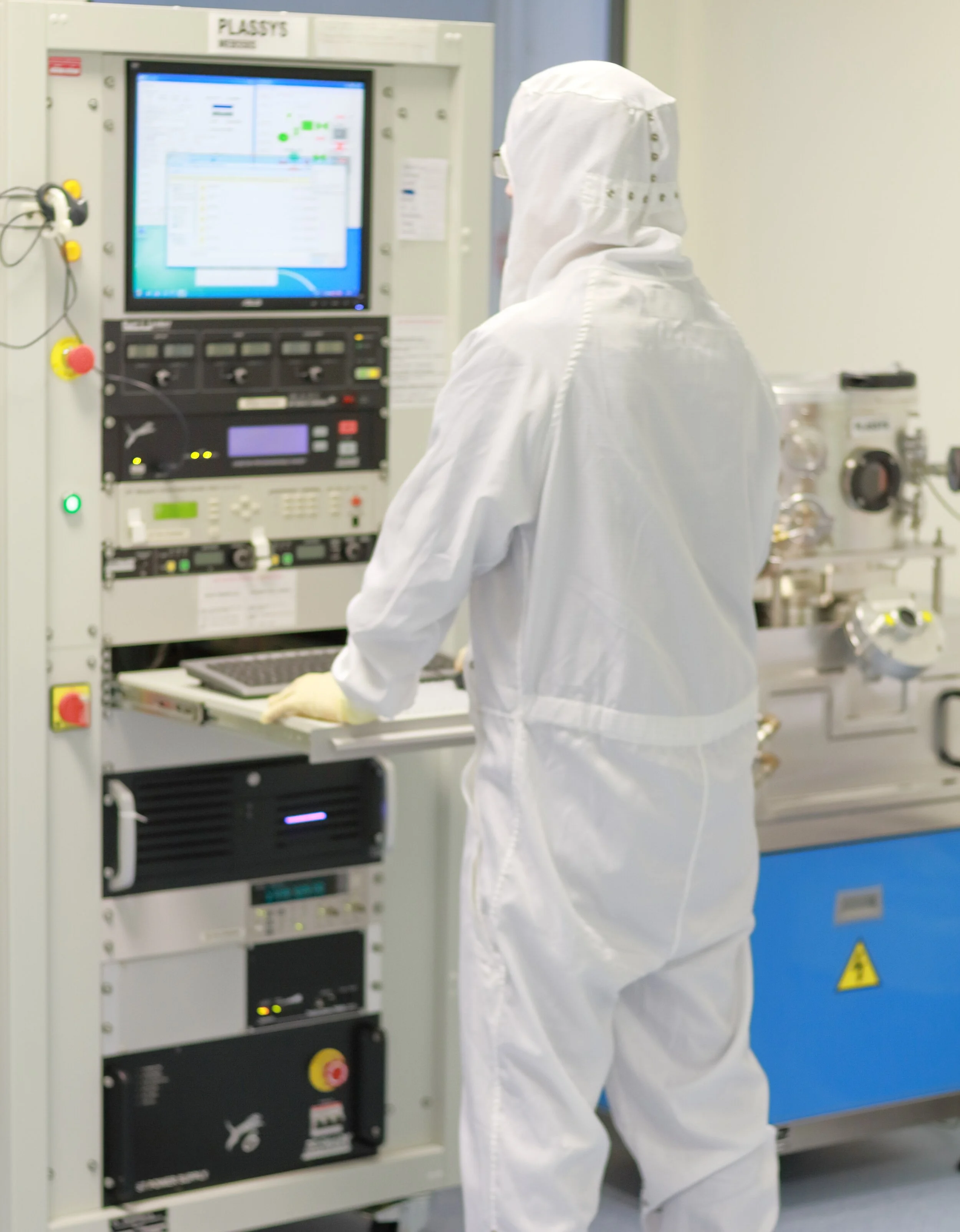
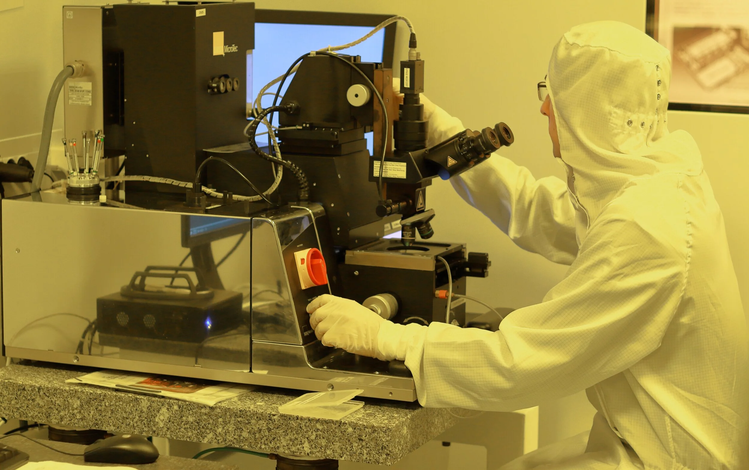
The problem
SiView is a complex and massive software offering employed by ~100 manufacturers, and is extremely outdated*
It was my job to take a look at the current system and provide a plan for improving the overall UX
*we’re talking no real UX updates in 20 years
Where to start?
This project was sold to me as, “come in and tell us how we can improve our system’s UX.” After an intro call, my contact shared hundreds of files with background info and programmer’s guides, and I quickly realized that there was so much more going on here than a straightforward piece of software with a few user flows and lines of functionality.
As I found out, SiView is currently in use at over 100 different companies, all with specific needs and customizations to their local version of the system. At each of these companies, there are (literally) dozens of user roles, spread across 7 applications to support the various requirements of semiconductor manufacturing.
Discovery
Get informed -> empathize
The first step was to get an idea of how SiView functioned, what current user flows looked like, and how it helped technicians on a daily basis. I scheduled walkthroughs of the different applications with system developers to help me put together a list of user roles and associated tasks.
I found that there was a huge variety in user roles and tasks from manufacturer to manufacturer, with this list representing a sample from a single company:
Mapping the current state
From there, I interviewed users in various roles and put together current state workflows. One such example was for the Process Engineer:
Make an engineering plan (which process/parameter to improve) and get necessary approval.
Create new route/product based on production route/product.
Create new branch routes with new recipe/parameter/data collection/reticle and attached branch routes to target operations.
Create/Change process conditions for the engineering product in APC/RMS.
Compare production process condition and engineering condition (on branch route) and release it to runtime.
Create inhibits (if necessary) on new recipe/reticle/etc to prevent it being used by production by mistake.
Create special SPC charts for new recipes (many charts are similar).
STB engineering lots.
Create PSM based on engineering plan to assign different wafers to different branch routes.
Create process holds (if necessary) to confirm process result and next conditions.
Create sorter jobs to physically separate wafers (if necessary) after PSM is done.
Confirm and compare process result of different wafers.
If not satisfied, STB another lot and do something different.
For good results, make request and get approval for production condition change (SM/SPC/APC/RMS). -> reviewer will need to review all the engineering process conditions and results etc.
Current UI
After gaining an understanding of the various users and task flows, I felt I had enough of a base from which to start looking at usability problems within the UI. I started with one of the applications, the Standard Material Manager:
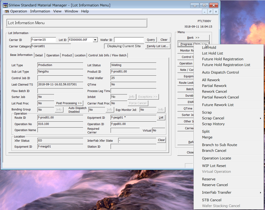

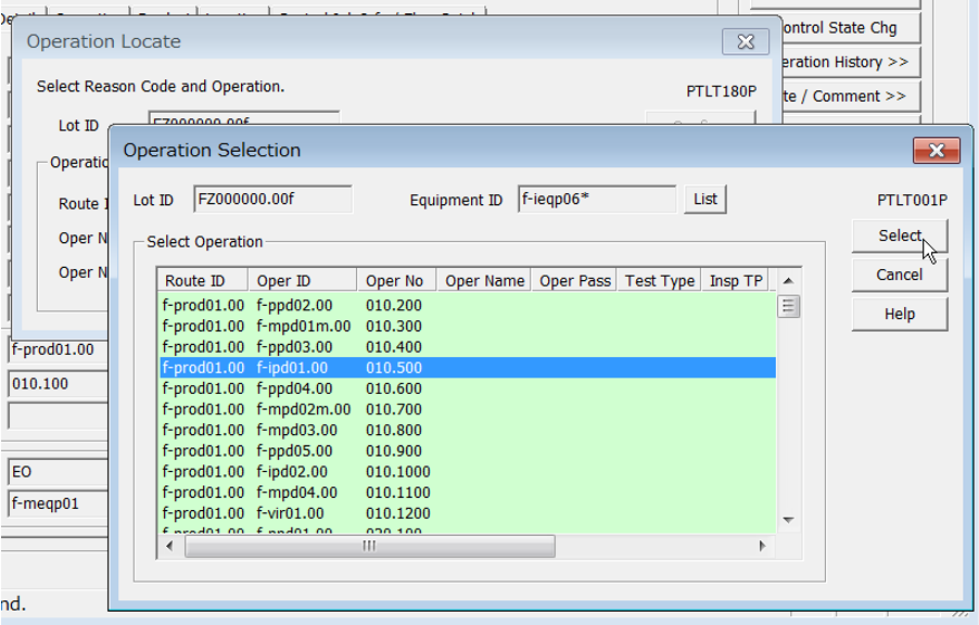
Each of these views contains a huge amount of information and functions - all of which could be useful to the user at some point in their job. Where it fails, entirely, is in streamlining the user’s typical workflow. There are hundreds of operations [Lot Information Menu], each of which normally requires a sequence of several dialogs to complete [Operation Selection]. Each of these selections requires time to locate and provides an opportunity for user error.
New developments
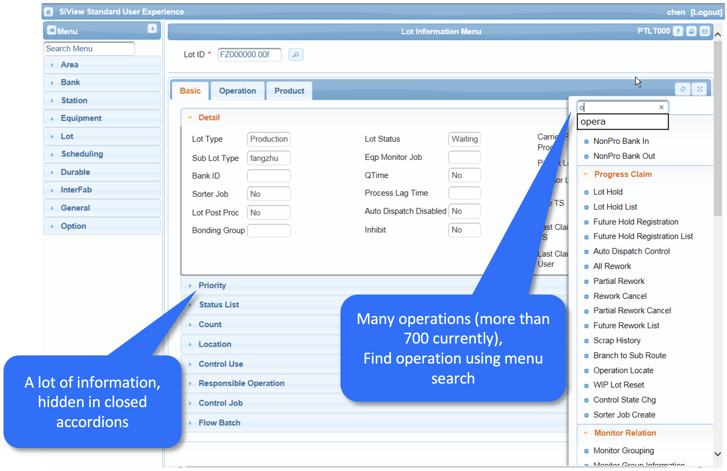
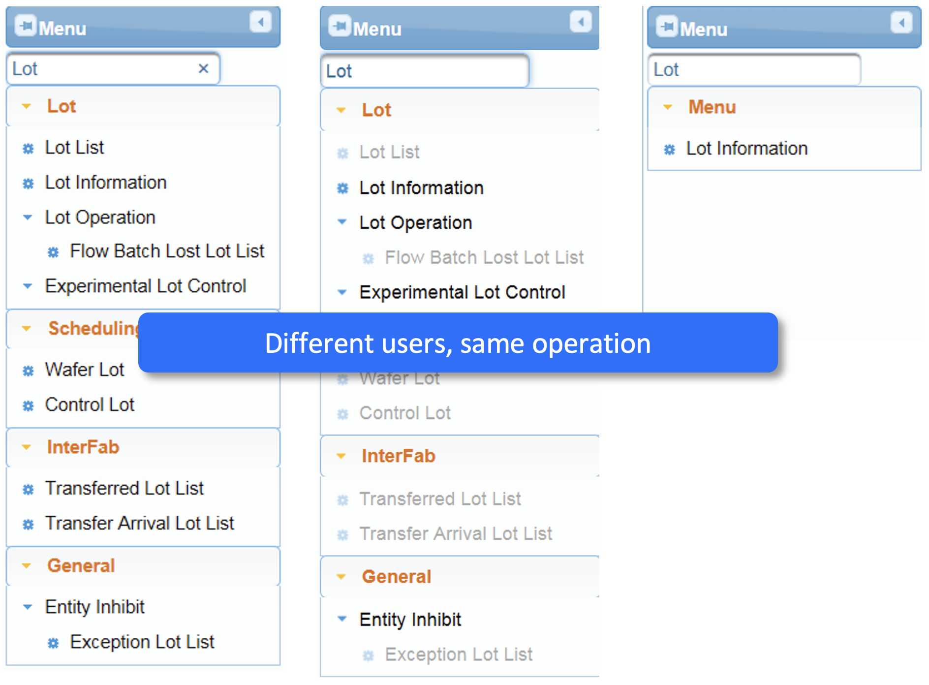
Over the previous 2 years, the SiView team had been developing a web version of the Standard system which began to address a number of the UI issues from the desktop client. However, it had not yet been implemented with any SiView customers, and clearly still left many usability problems to be addressed.


Reflect
At this stage, it was clear that the scope of the project was far greater than anticipated. After gaining an understanding of the variety of users and task flows, I decided to change my approach. There was no way that I was going to be able to assess the usability of the entire system and provide guidance for specific improvements in the 2-week timeframe we had agreed upon.
New direction
A proposal
I reached out to my contact on the team and proposed a new idea: I would mock up one or two illustrative views of how the UI could be improved, and prepare a detailed project plan for the full assessment and redesign of the system. The reaction was skepticism, at best, but I convinced them to give me a shot.
Principles for a future SiView UX
Accessibility
Easy for new users to learn
Visual interface that reflects real-world equipment on the floor
Usability
Seamless flow from system to system
Streamlined, task-based interface
Simple project status and tracking from a home page
Flexibility
Versatile customizability to meet customers’ specific manufacturing processes and needs
Adaptable to specific user roles and task requirements
Principles in practice
In addition to outlining basic principles for the new design, it was important for me to show the team what that could look like in practice. With input from a few of the system developers, I mocked up two screens from a theoretical new SiView, to show my design principles applied.
Both of these screens show a lot of information, as is needed by the engineers, but they do so in a more visual and organized way. Tasks are grouped and ordered by priority and status, with a basic summary available from the base screen. In the below image, batch status is shown on a progress bar, and a summary of the individual lots is displayed with a simplified visual of the equipment.
Project plan & approach
For the project as a whole, I suggested a 3-phase approach, from user research through rollout to SiView’s 100+ customers.
Detailed approach and effort estimation for the first phase - User Research & Design:
Resource plan for the full project, illustrating an initial investment of 250 person days, which would lead to a full plan for delivery:


